Campaign Motivation
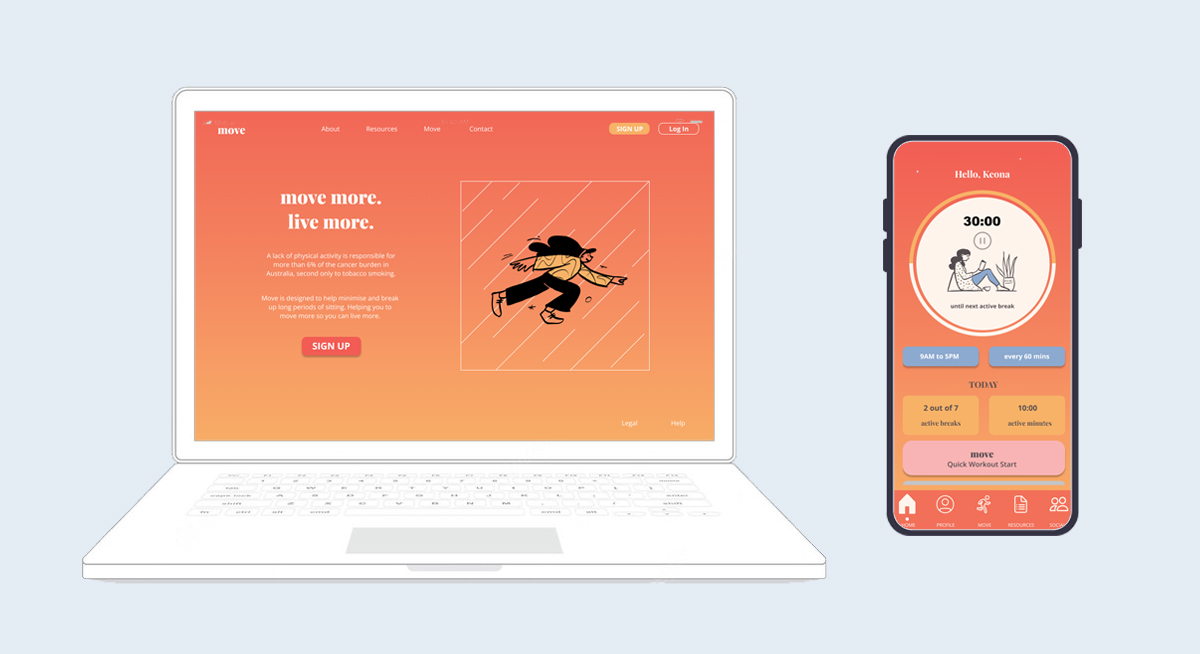
The main motivation behind Move is to help individuals combat sedentary habits and improve their overall physical health. It has been designed to have an easy flow between desktop and mobile by using similar features.
Designed from user research, Move assists different individual lifestyles; from couch potatoes to aspiring marathoners.
The app features 5 key sections:
- Home page
- Profile
- Move (Activities)
- Resources
- Social
Based on user goals and motivations, the app allows users to easily track active breaks and movement.
Move on Desktop focuses on users that spend their working days seated at their desks. A desktop platform allows users to set an active reminder in the background and participate in exercises at their desks.
Key Sections
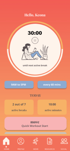
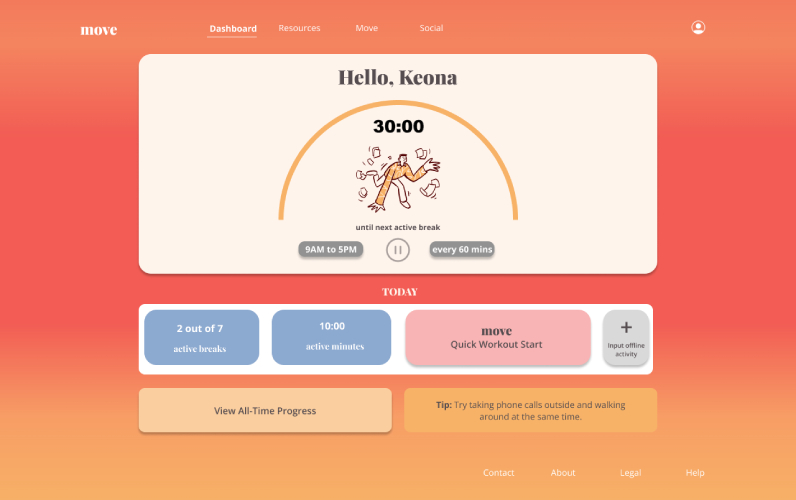
The Home page features a timer that enables users to set how often they would like to be reminded to move. Buttons below allow easy access to start quick workouts or check daily progress.
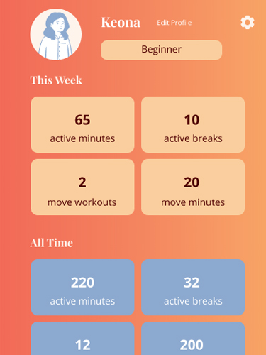
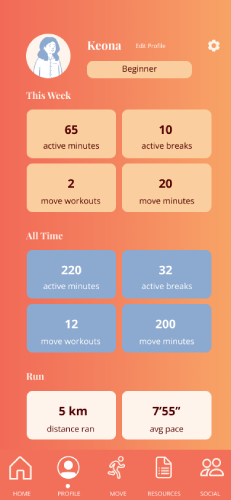
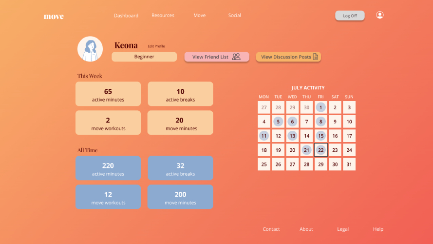
The Profile page enables users to adjust their difficulty level, track progress and view friend list.
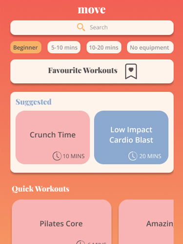
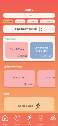
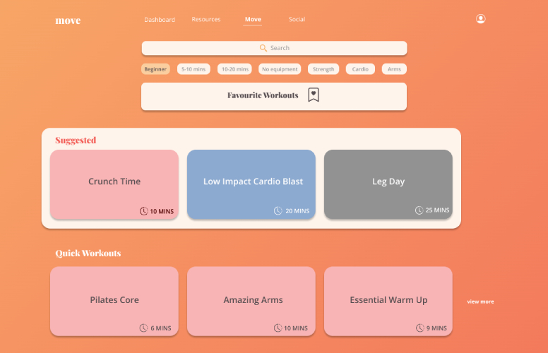
Arguably the most important page of “Move” is the Move page that features a variety of workouts. Users can easily search for workouts using key words or through quick selection with suggestions below the search bar. Workouts are grouped by type, including Weightlifting, Dance & HIIT.
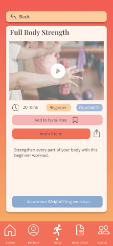
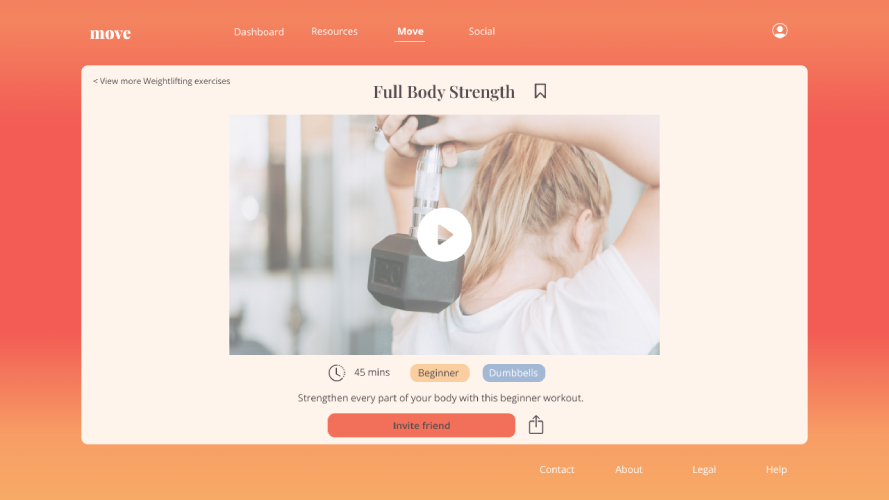
Individual workout pages feature videos or diagrams that users can follow along. Move is designed for all levels of activity and encourage beginners to take part too.
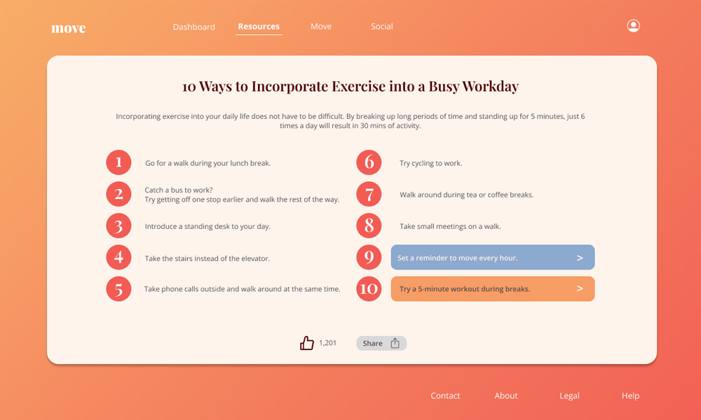
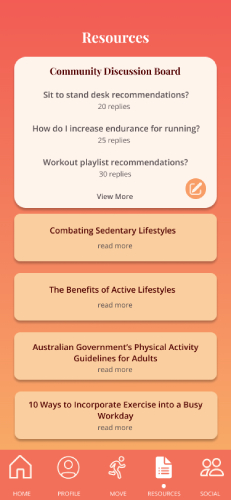
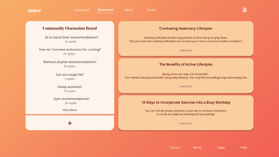
The Resources page aims to increase user knowledge and create a fitness community where individuals can share tips and encouragement. If users are unable to find information, they are welcome to post a new topic/question on the Community Discussion Board.
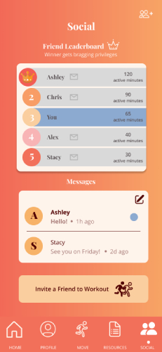
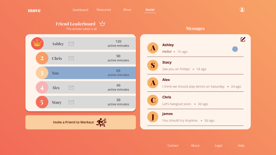
From user research, it was found that exercising with a friend or having someone to hold you accountable is one of the biggest motivators. The Social page displays a Friend Leaderboard where users can compete with their friends for the most active minutes. Users can chat and even work out together.
User Research & Testing
Personas & Customer Journey Maps
Personas, Customer Journey Maps & Mapping played key parts in helping organise the content of Move and identifying pain points.
User Flows & Prototypes
Prototypes were made in Figma to assist with user testing and understand how the design can be improved to better fulfil user needs.
User Testing Results & Annotated Wireframes
User testing helped to pin point errors in navigation and gain user feedback. From this, the design of Move was improved.
Social